Interactive Chart Selector
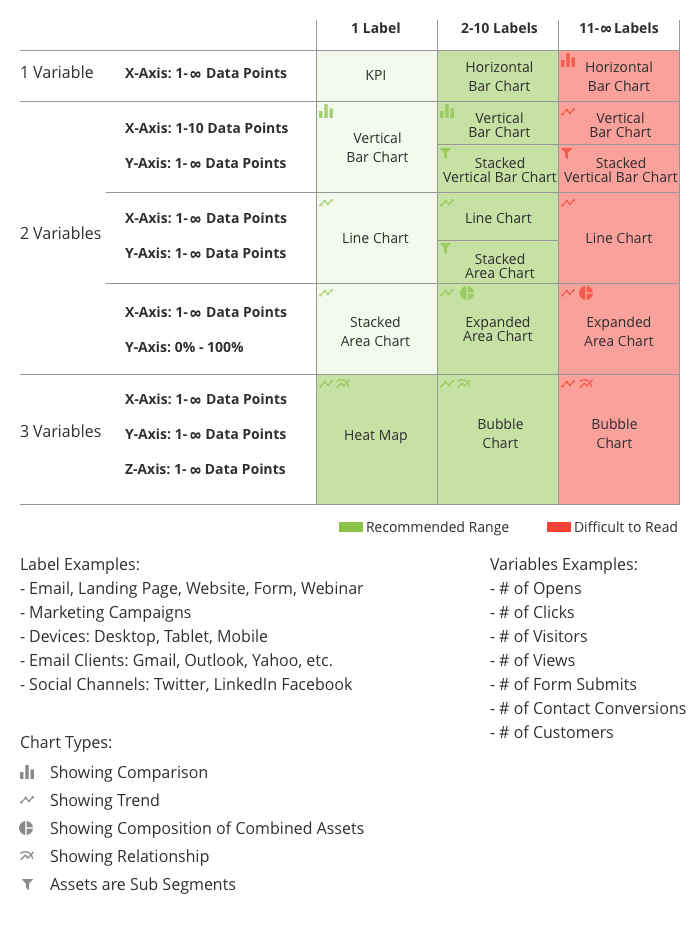
This project, more than any other, deepened my understanding of data visualization. I designed an Interactive Chart Selector tool to help multiple teams consistently select the right visual formats based on their specific data types. The tool utilizes variables and data points to determine the best possible chart for the user's needs, while also highlighting effective and ineffective chart examples.
The team found the tool incredibly helpful for understanding not just which charts to use, but why. It ultimately enabled team members to work more effectively while simultaneously leveling up their knowledge of data visualization best practices.