Insights Leadership Case Studies

The Deepening Framework
Our goal was to increase "share of wallet" from 35% to 70% by improving how financial advisors manage client relationships. Through stakeholder interviews and competitive analysis, I identified a missing "Contact Strategy" tool. Advisors were currently using manual workarounds to maintain the consistent meeting cadences required to build trust and grow assets.
I guided the development of a new, centralized Contact Strategy tool through iterative generative and evaluative testing. This research transformed a fragmented, manual process into a streamlined digital workflow that supports advisor coaching and data reporting. After launch, I utilized analytics to monitor adoption, ensuring the tool effectively supported the firm’s long-term growth and advisor success.
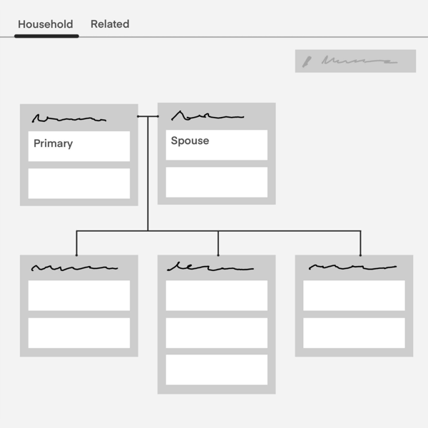
Householding Clients
Our financial advisors manage households but their software tools did not allow them to combine clients together into a household. Because of this, there was a large gap in their software tools and it caused challenges for them to do their job.
We conducted discovery research to understand how the financial advisors think about households and to understand the various household scenarios. We developed the MVP and released the household tool in phases. After 3 months of the household tool being released to all financial advisors, we measured a 92% adoption.

The Financial Advisor Ecosystem Playbook
I identified a significant knowledge gap where product teams lacked a unified understanding of our financial advisor segments. To solve this, I proactively led a cross-functional initiative, conducting stakeholder interviews across three lines of business to codify the history, goals, and specific roles within the advisor ecosystem.
I synthesized this research into a foundational framework on the J.P. Morgan financial advisor ecosystem case study that became the organization’s "source of truth." By centralizing these insights, I eliminated redundant discovery work, allowing design and product teams to bypass basic questions and focus on high-maturity innovation and targeted user problems.
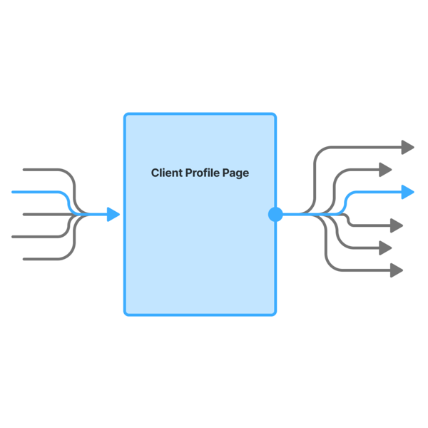
Optimizing the Client Profile Hub
As the most visited page in our platform, the Client Profile was a high-priority candidate for modernization. Through contextual interviews with financial advisors, I discovered that starting a money transfer was a common task, yet the process was hindered by a multi-step workflow. By performing a heuristic evaluation, I identified that the initial four-step sequence could be consolidated into a single step, significantly reducing the cognitive load and potential for human error during sensitive financial transactions.
I validated the streamlined one-step solution through testing, which confirmed that the new flow was both intuitive and more efficient. The impact was immediate: upon launch, we saw 33% organic adoption even before an official announcement, reaching 100% adoption shortly after. By simplifying this core task, we not only improved the advisor experience but also established a more reliable and faster framework for firm-wide money transfers.
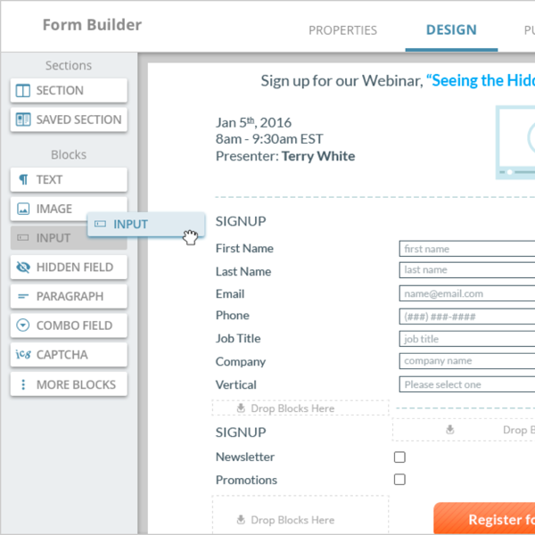
Form Builder
The Form Builder—one of four core authoring tools at Act-On Software—was hampered by outdated technology and a fragmented user experience. Our goal was to modernize the feature while aligning its interaction patterns with our established design system. While form logic can become inherently complex, my mission was to strip away friction and ensure the tool remained intuitive for marketers, regardless of the form's complexity.
By standardizing UI components and simplifying technical workflows, we transformed a legacy feature into a cohesive, delightful experience. This alignment across the product suite reduced the user’s learning curve and empowered marketers to build sophisticated forms with greater speed and confidence.
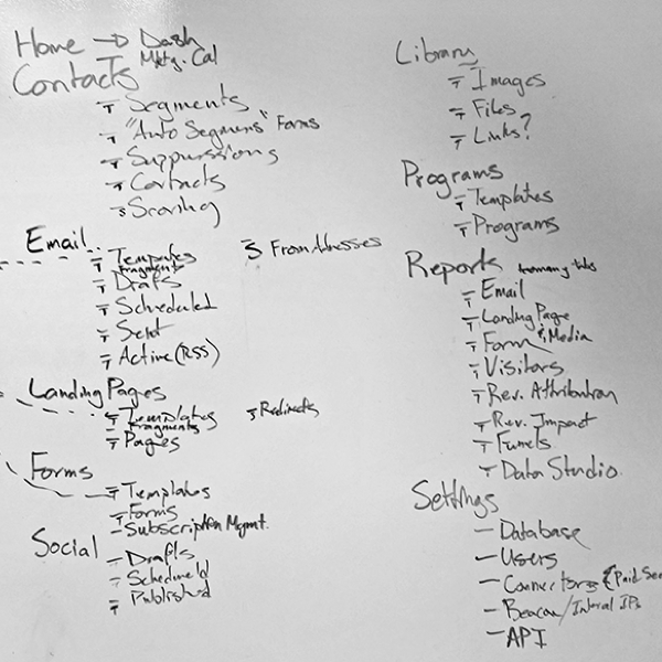
Information Architecture
Our team set out to overhaul the product’s main navigation to improve both findability and feature awareness. By developing a comprehensive journey map tied directly to our user personas, we identified critical gaps between the existing architecture and the users' actual mental models. Our objective was to create a navigation system that felt intuitive while proactively surfacing new, high-value features.
The result was a redesigned information architecture that mirrors the natural user workflow. This alignment significantly reduced the effort required to locate core tools and improved the discoverability of new features. By prioritizing the user’s journey over a generic menu structure, we created a more seamless and efficient navigation experience.
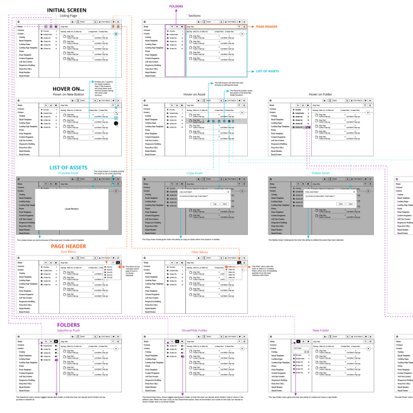
Content Listing
The Contact Listing Page is a central hub where marketers manage high volumes of assets, including emails, landing pages, and segments. To optimize this experience, I mapped complex user flows and conducted usability testing to pinpoint friction in the management process. Our primary objective was to streamline these interactions for a desktop-first environment, ensuring that marketers could manage their assets with maximum speed and minimal cognitive load during high-pressure campaigns.
By translating research insights into refined, task-oriented designs, we significantly improved the efficiency of the asset management workflow. The final solution prioritized a desktop experience tailored to the professional marketer’s workspace, replacing difficult legacy interactions with intuitive, high-speed controls. This redesign empowered users to navigate their content libraries more effectively, directly supporting their goal of rapid campaign execution.
Design Systems
To ensure visual consistency and development speed, our team established a scalable Design System built on an “Elements > Components > Pages” framework. My goal was to move away from ad-hoc styling and toward a unified language that aligned with our brand identity. By defining foundational elements like color, typography, and spacing before building complex interactive components, we aimed to create a simplified, modular system that could grow with the product.
This tiered architecture streamlined the handoff between design and engineering, providing a clear, shared vocabulary across departments. By centralizing components like tables, menus, and input fields, we reduced design debt and ensured a cohesive user experience across all pages. The final system not only improved design efficiency but also provided a robust, scalable foundation for future product innovation.
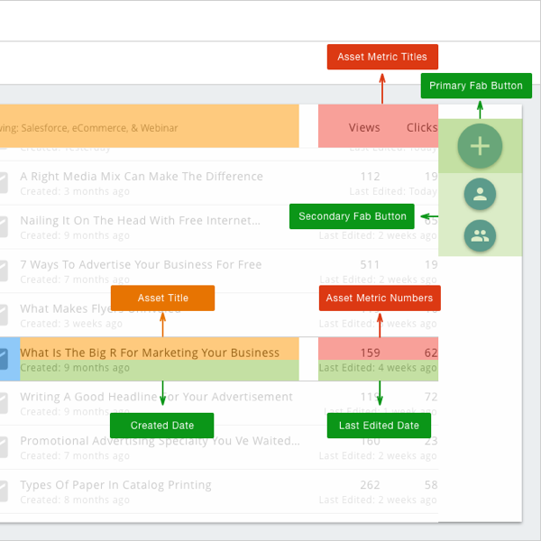
Interactive Chart Selector
To improve consistency in how our teams visualized data, I designed an Interactive Chart Selector that standardized the transition from raw data to visual insight. I recognized that teams often struggled to choose the most effective visualizations for their specific data types. My goal was to build an intelligent tool that used variables and data points to recommend optimal chart types while educating users on best practices through "good" and "bad" comparative examples.
The selector became a vital educational resource, empowering team members to make evidence-based design decisions and deepen their data visualization literacy. By providing a clear logic for chart selection, the tool increased team efficiency and ensured that our data stories were both accurate and accessible. This project transformed a complex decision-making process into a streamlined, repeatable workflow.
Media Listing
To better bridge the gap between design and development, I built a fully functional, clickable prototype of a Media Listing page using HTML, CSS, and JavaScript. Starting with a high-fidelity design in Sketch and utilizing the Bootstrap framework, I transitioned the concept into JS Fiddle to explore the technical constraints of my work. My primary goal was to define and refine the subtle animated transitions and interactive states that are often lost in static design handoffs.
This hands-on coding approach provided deep insights into the front-end requirements for various design states, from hover effects to responsive behavior. By "stepping into the shoes" of a developer, I gained a much stronger understanding of technical feasibility and how to prepare assets for a seamless handoff. This experience has significantly improved my ability to communicate with engineering teams and create designs that are both high-performing and easier to implement.
Personal Projects
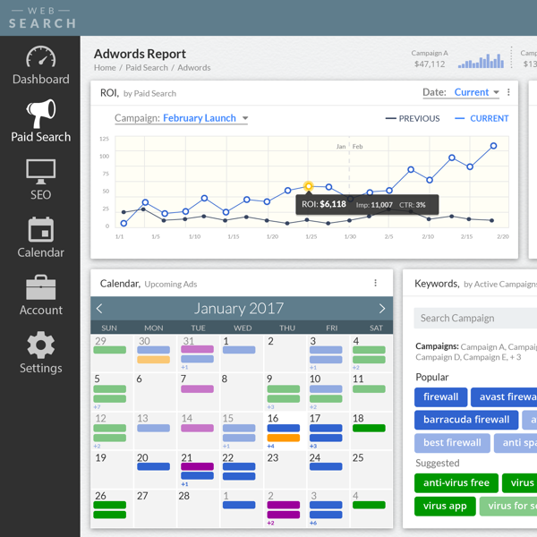
Beyond my core roles, I maintain a diverse portfolio of independent projects ranging from complex dashboard interfaces to data-heavy report designs. Each project serves as an opportunity to solve unique user problems across various industries, requiring a balance of high-level strategy and pixel-perfect execution. My objective with these projects is to refine my visual storytelling and ensure that even the most data-dense interfaces remain accessible and user-centric.
Engaging in these varied challenges has deepened my expertise in micro-interactions and visual hierarchy across different platforms. By continuously tackling new design problems, I stay at the forefront of emerging UI/UX trends and technical constraints. This ongoing practice ensures my skill set remains versatile and that I can bring fresh, cross-industry perspectives to every team I collaborate with.