At a Glance
Project Name: “Design System: Building a Unified Product Language”
| Challenge | The product ecosystem suffered from significant "design debt," with inconsistent UI patterns and redundant code across different workstreams. This lack of standardization slowed down development velocity and created a disjointed experience for the end-user. |
|---|---|
| Outcome | Architected a centralized, scalable Design System that established a single source of truth for both designers and developers. By codifying reusable components and documentation, we streamlined the production lifecycle and ensured visual and functional harmony across all platforms. |
| My Role | Lead UX Designer |
| Timeline | 12+ Months (Ongoing Evolution) |
| Activities | UI Audit, Component Architecture, Accessibility Standards, Documentation & Governance |
| Success Metrics | Increased Development Velocity: Reduced design-to-development handoff time and eliminated 90% of UI inconsistencies across new feature releases. |
Challenge
I was hired as the first and only designer on Act-On’s product team. When I started, the product lacked an established design system; it was my responsibility to develop, maintain, and manage the implementation of one from the ground up. I worked closely with product managers and front-end developers to establish a visual language true to our core brand principles: trustworthy, intelligent, and powerful. Our goal was to build a foundational system that could easily scale while ensuring future web pages remained aligned with our brand.
Approach
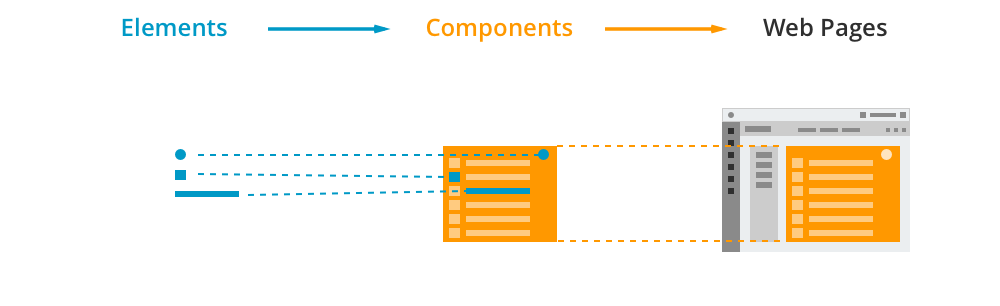
My initial approach to building the design system involved three distinct steps:
- Define the Elements: Standardizing foundational tokens, including the color scheme, typography, icons, and spacing specs.
- Build Components: Using those elements to construct reusable components like buttons, input fields, tables, and menus.
- Create Pages: Combining components to build complete layout templates.
This simplified hierarchy made the system easy to scale and helped the engineering team execute designs seamlessly.
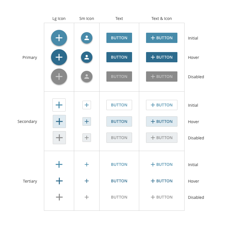
Elements & Components
Our foundational components include buttons, menus, text boxes, checkboxes, radio buttons, tabs, tables, and tooltips. Once our visual language was finalized, it directly dictated how these assets were styled. This eliminated subjective debates over personal design preferences, establishing a strict consistency that inherently improved the overall user experience.
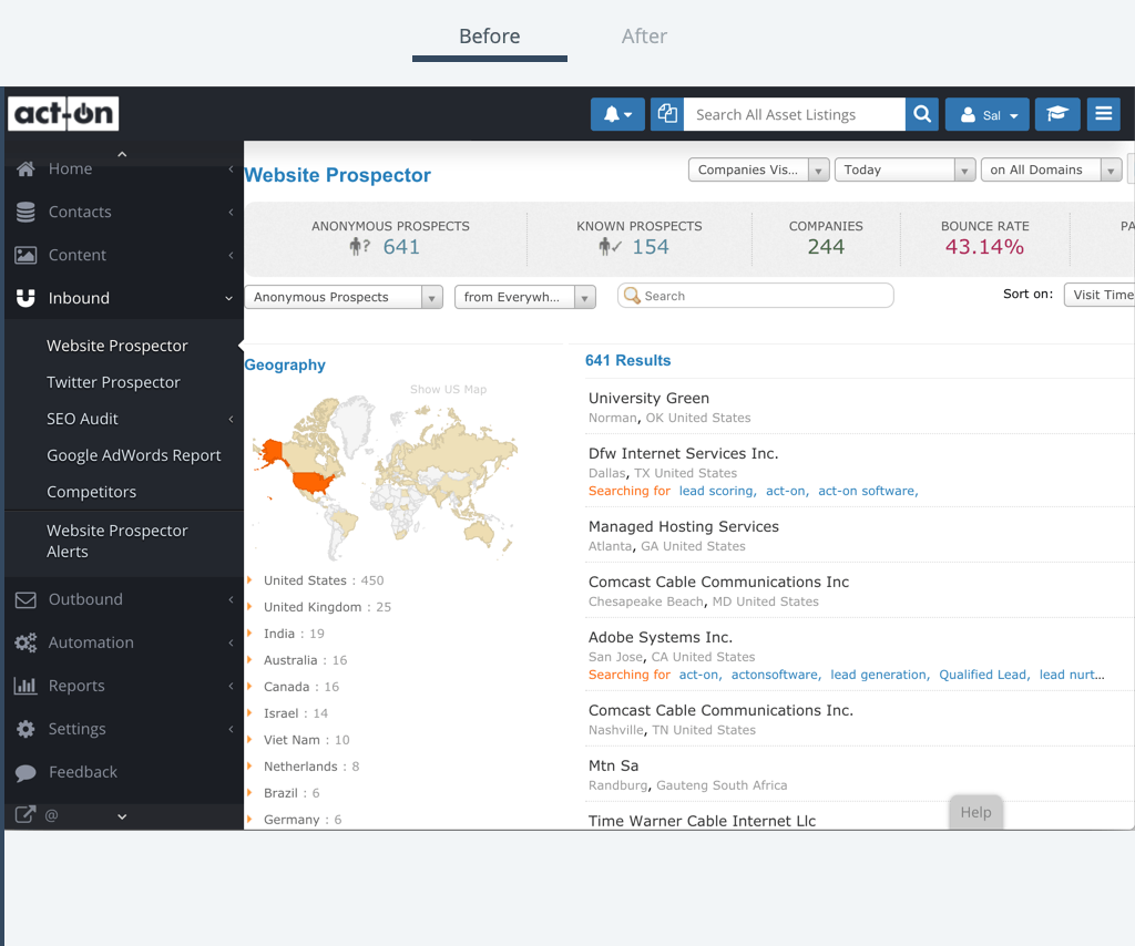
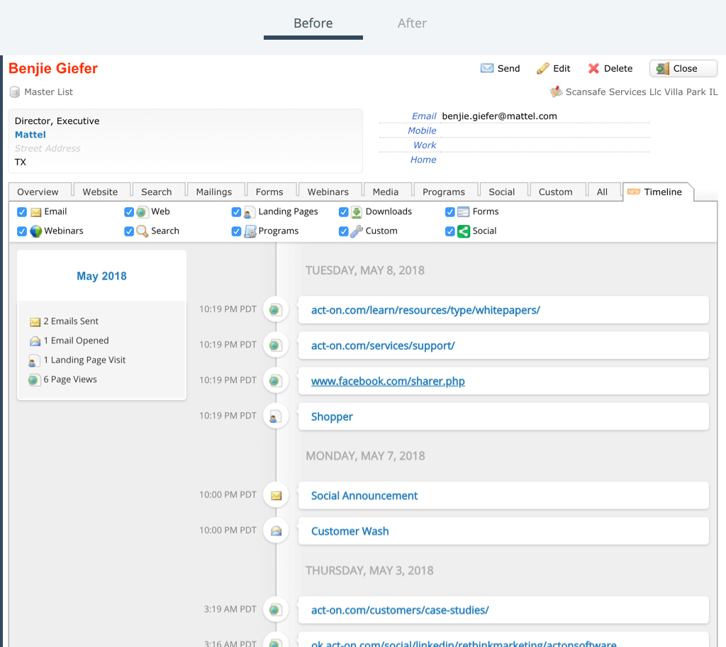
Before & After
The transformation of the product pages before and after the design system implementation highlights a massive leap in visual quality. Applying the system established a beautiful UI aligned with our corporate brand and introduced interactions that feel modern and intuitive. Furthermore, every element, component, and page layout was given a specific purpose: elements matched the brand, components had predictable interaction patterns, and pages map directly to the user journey.
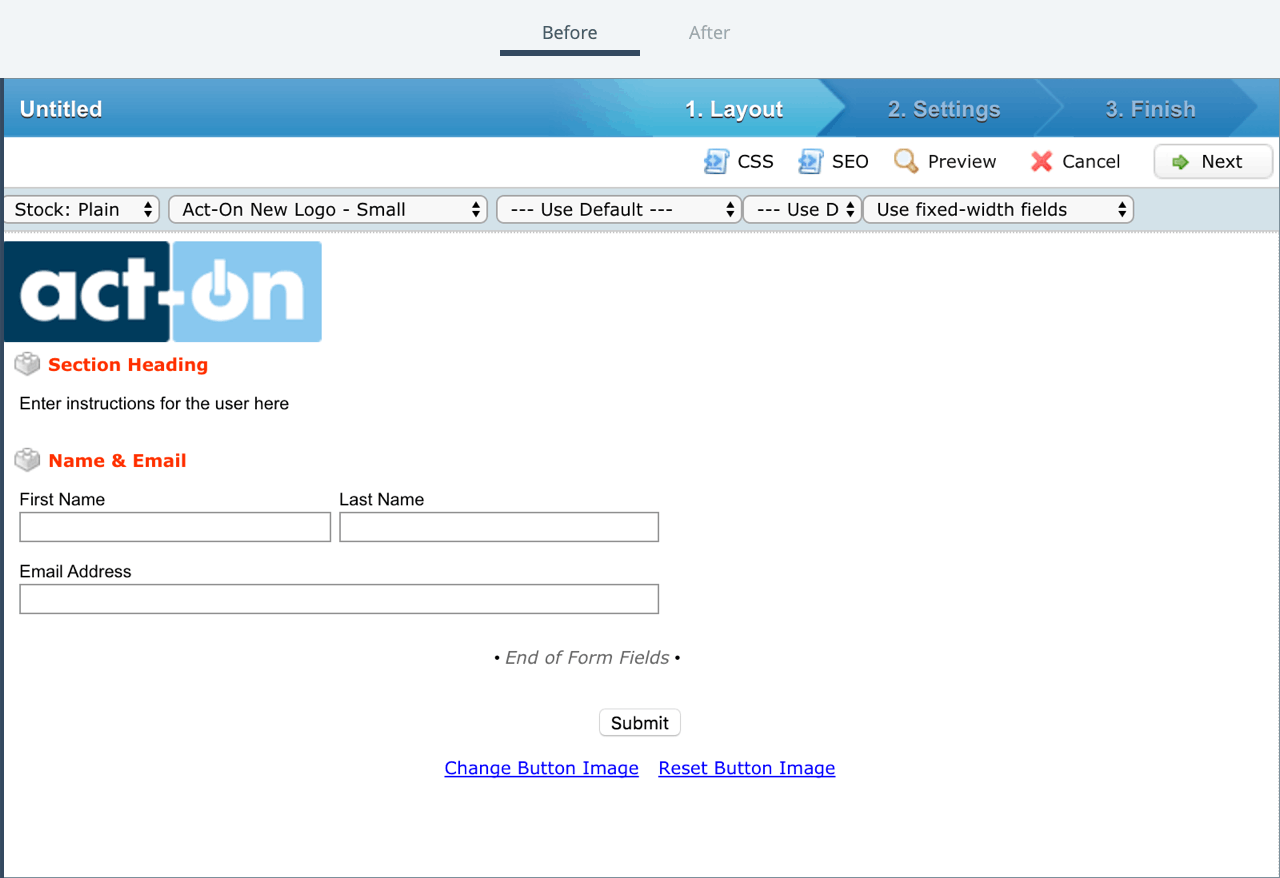
Before & After: Contact Profile
Before & After: Form Builder
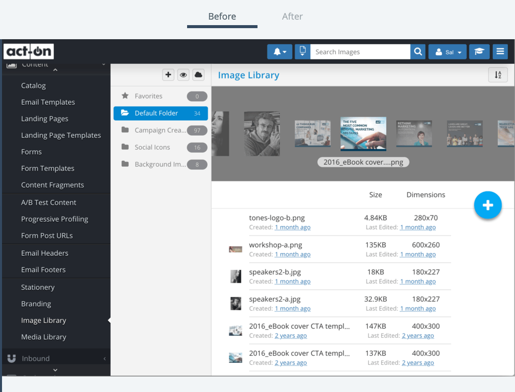
Before & After: Image Library
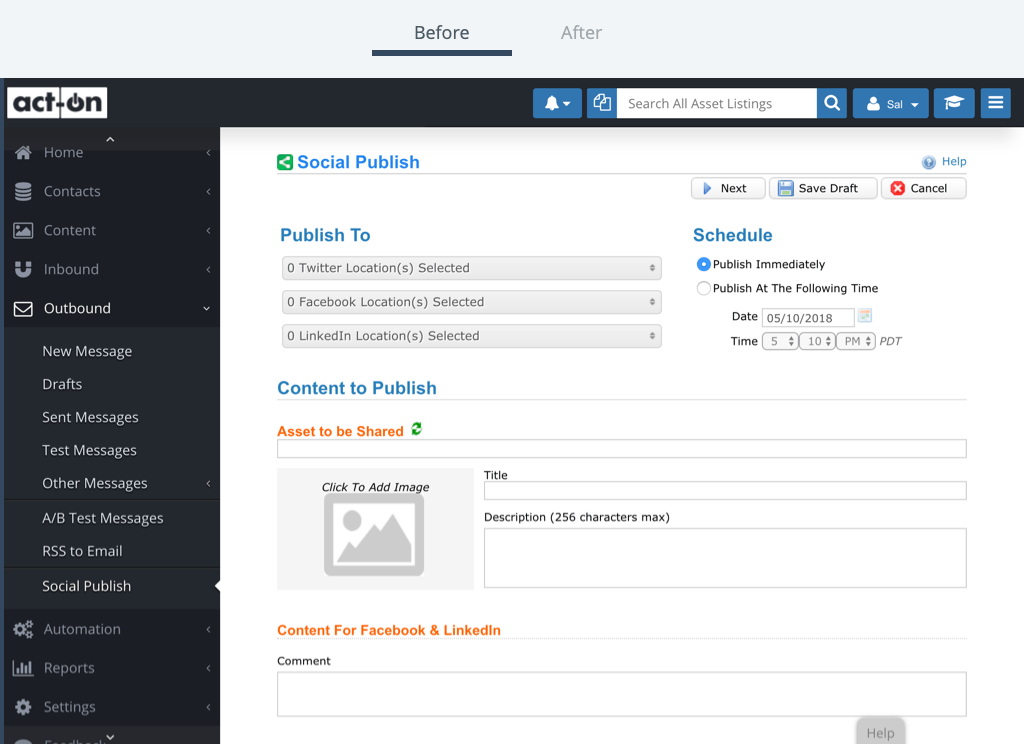
Before & After: Social Post
Documentation
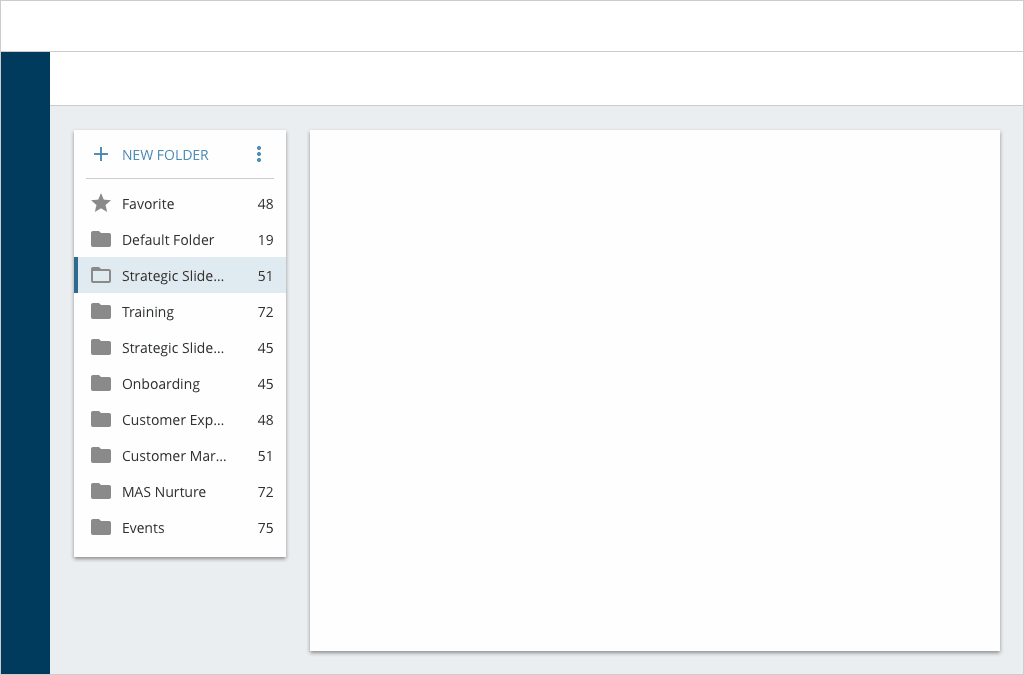
When elements are composed together in a specific structural configuration, they form a component which can then be deployed across the app. For example, the "Folders" component utilizes multiple foundational elements like buttons and icons. While designed out of necessity for the core listing page, it remains available as a global asset for any new page layout. To ensure seamless developer handoffs, each component is fully documented with labels, spacing, and alignment specifications.
Result
The biggest hurdle in this project was solidifying a visual language that was simple, clear, and foundational. Once that foundation was secure, accelerating future design and development tasks became incredibly efficient.
Ultimately, we successfully consolidated and simplified the application from 300 complex pages into 5 core page archetypes. Establishing this long-term product vision within the design system provided immense value to the cross-functional team, paving the way for rapid, unified feature development.