At a Glance
Project Name: “Form Builder Redesign: From Legacy to Lead-Gen”
| Challenge | The existing Form Builder was hampered by five-year-old legacy technology and an outdated UX that created significant friction for users. The tool required a complete overhaul to meet modern accessibility standards and user expectations for speed and ease of use. |
|---|---|
| Outcome | Architected a modern, component-based Form Builder from the ground up. By streamlining the creation process and introducing an interactive map interface, we transformed a frustrating legacy tool into a high-performance asset. |
| My Role | Lead UX Designer |
| Timeline | 12 Months |
| Activities | Low-Fidelity Concepts, Interactive Map Design, Component Library Definition, High-Fidelity Prototyping |
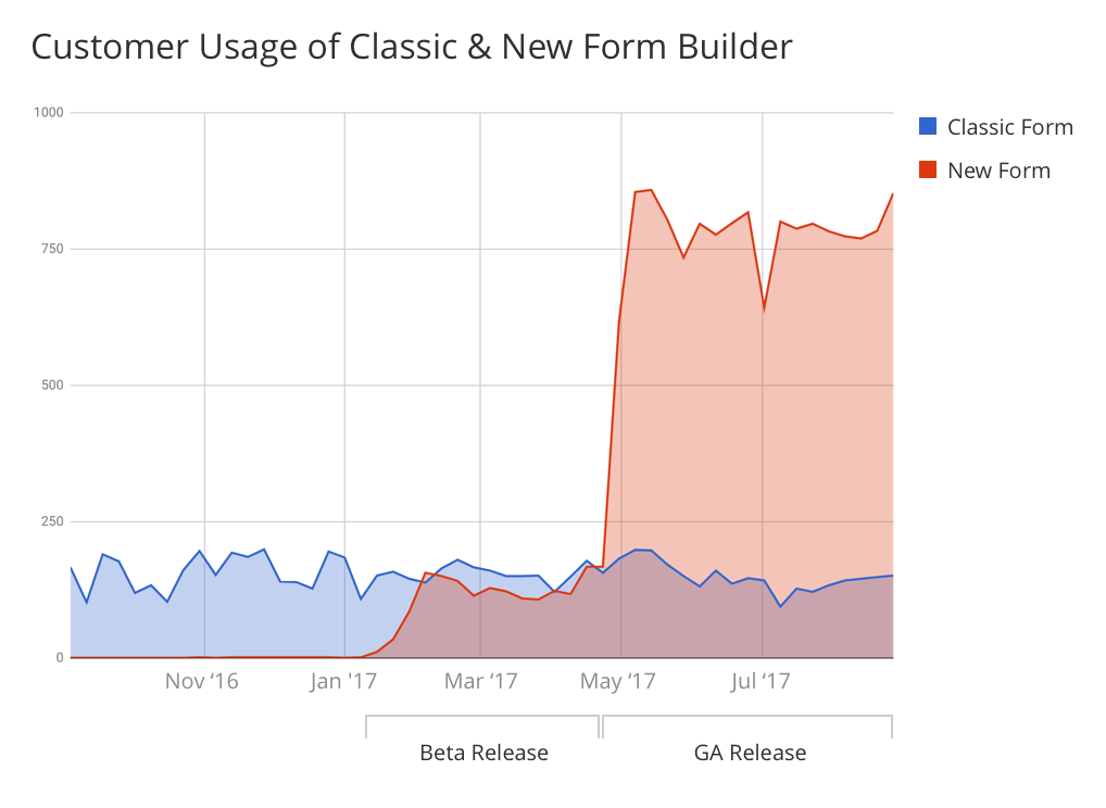
| Success Metrics | 300% increase in customer usage within the first 2 months of launch. |
Challenge
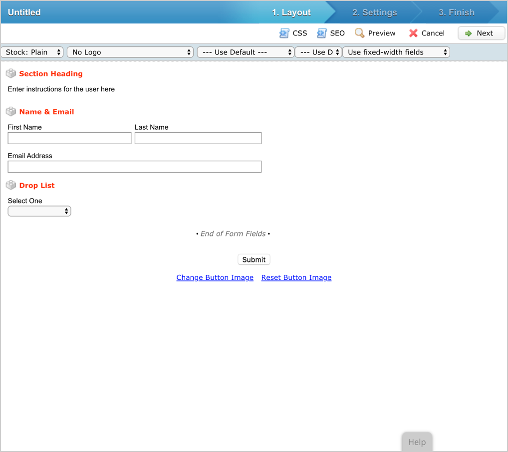
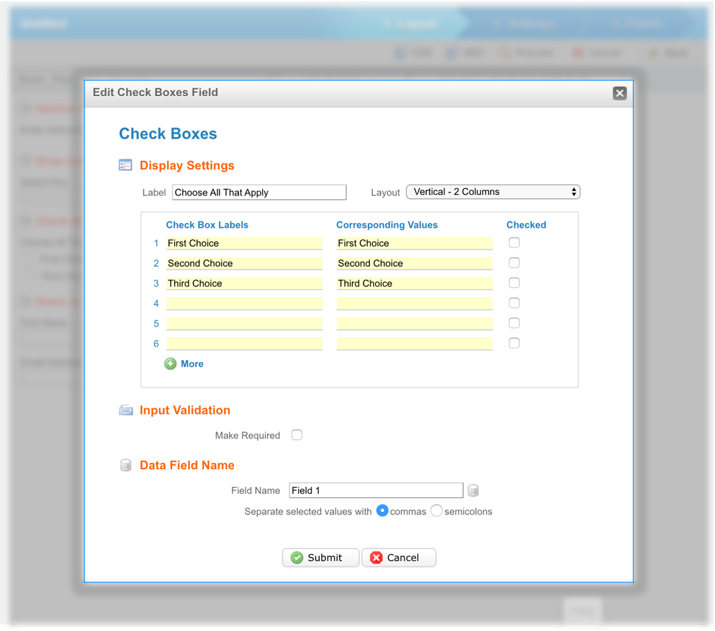
The Classic Form Builder was outdated, relying on legacy technology and an obsolete user interface (UI) design. At first glance, the classic interface was overwhelming, crowding the screen with multiple options but offering no clear primary action. To transform this feature into an experience that was both easy to understand and intuitive to navigate, a complete overhaul was required.
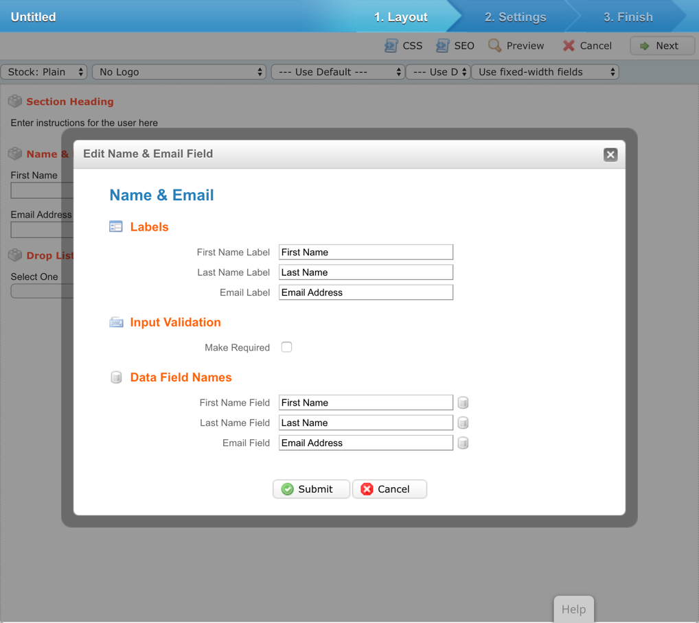
We began by researching exactly how customers interacted with the Classic Form Builder. It was essential to preserve core, high-value technical capabilities while systematically introducing usability improvements. For instance, the legacy builder relied heavily on intrusive modal windows to let users edit form input fields. In the new Form Builder, we transitioned these to an elegant slide-out interaction panel—aligning with the established design patterns used in our recent Email and Landing Page Builder redesigns.
User Persona
One of a marketer’s greatest challenges is identifying exactly why a specific campaign succeeded and determining how to replicate that success. By designing features that clarify these performance drivers, the platform empowers marketers to become significantly more efficient. When our users achieve that level of operational efficiency, our product is doing its job successfully.
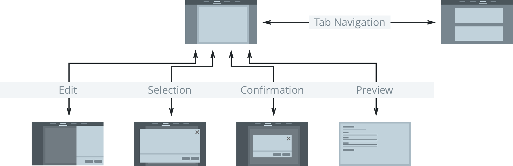
Five Core Interactions
To ensure a predictable user experience, we mapped out the foundational user flows within the Form Builder around five core interaction states: Navigation, Editing, Selection, Confirmation, and Preview. Standardizing each of these states ensured strict behavioral consistency across the feature.
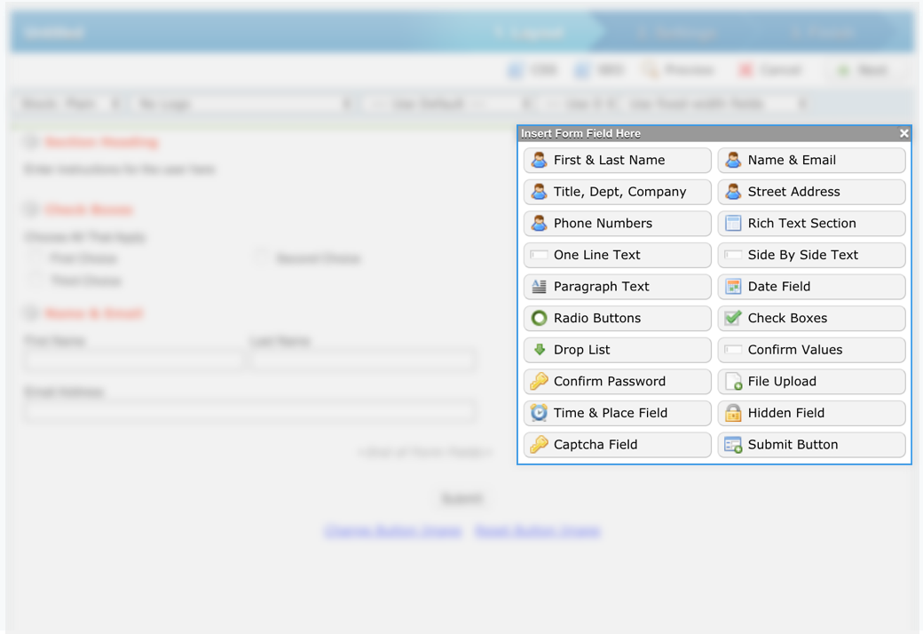
Content Blocks
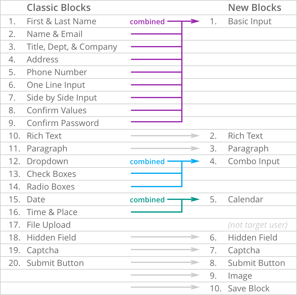
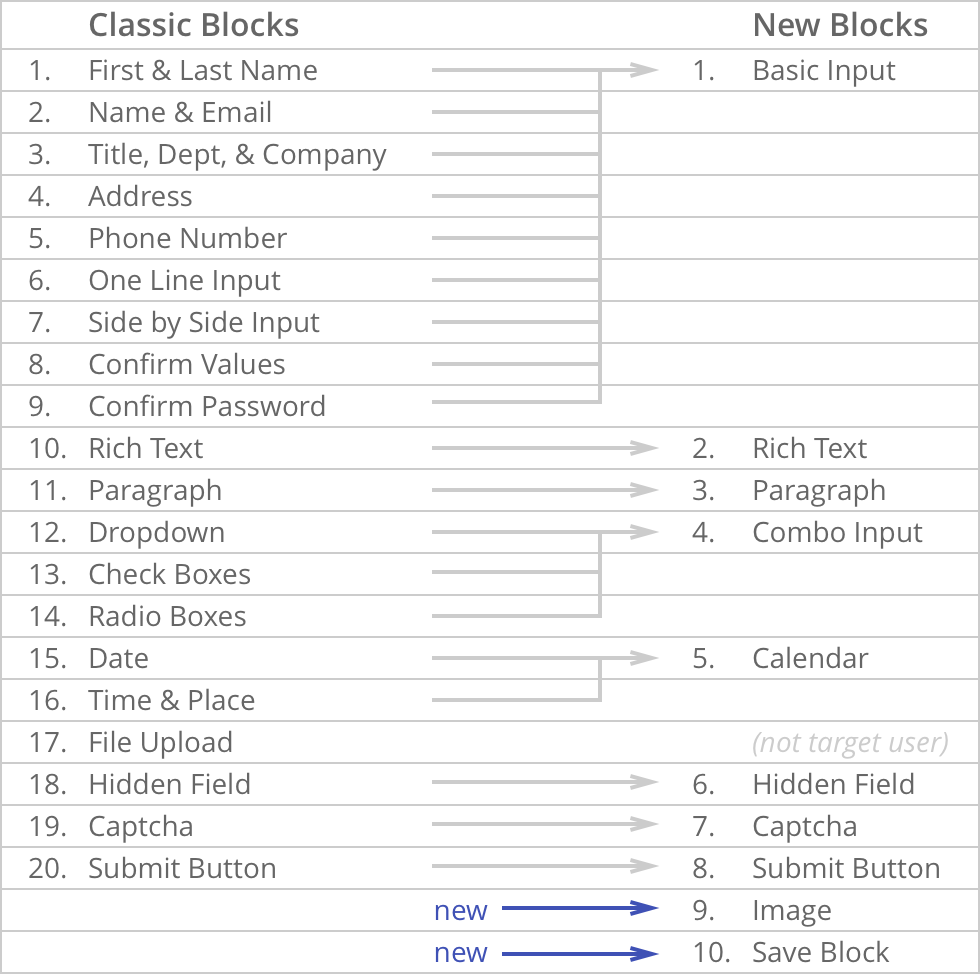
Content Blocks serve as the core framework for users to construct and modify their forms. The legacy tool suffered from feature bloat, offering an overwhelming 20 distinct Content Blocks. Our goal was to drastically simplify these options to prevent cognitive overload, making it much faster for users to identify and select the correct asset for their task.
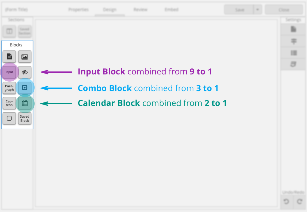
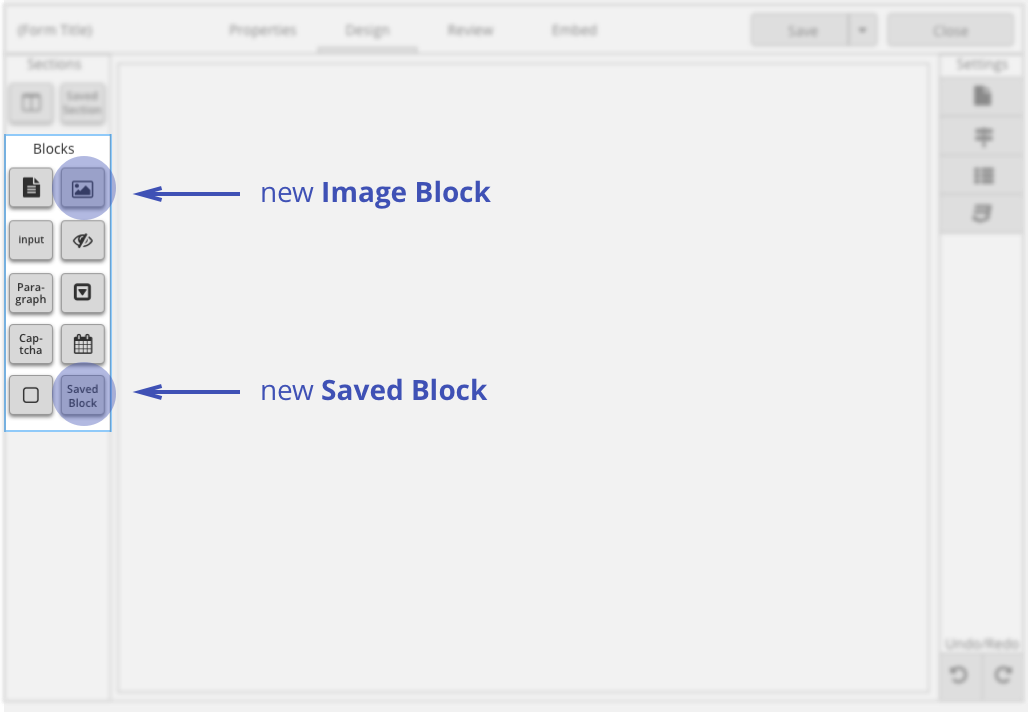
Ultimately, we consolidated the original 20 blocks down to just 8 core blocks without sacrificing a single piece of existing functionality, while introducing two entirely new feature blocks to expand user capabilities.
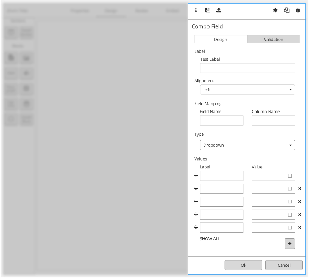
The Combo Block
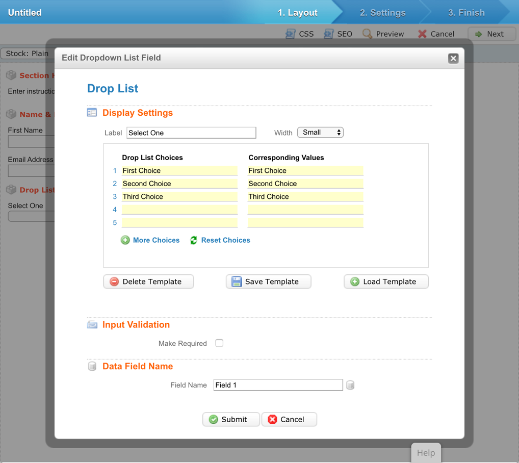
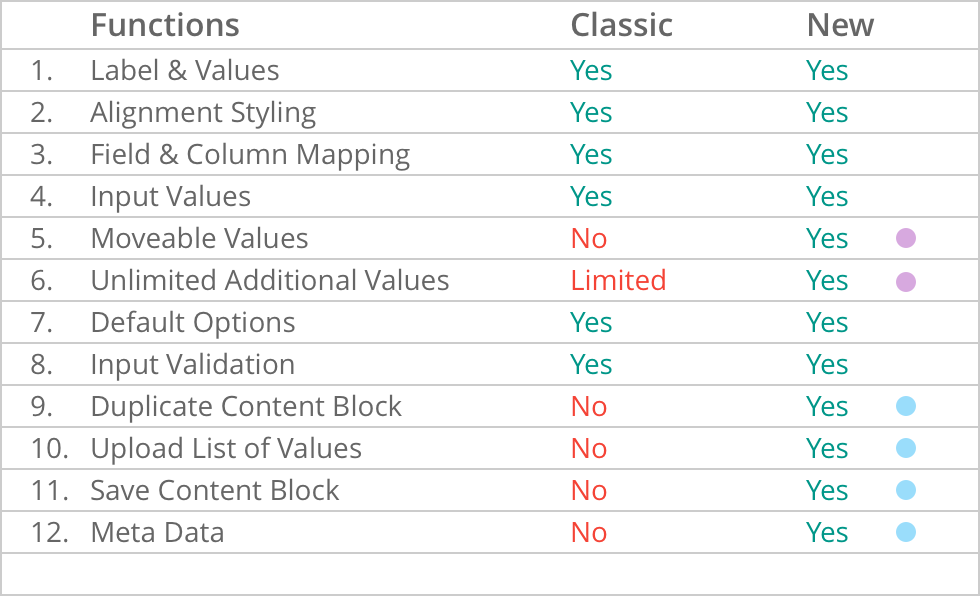
A key component of this consolidation was the creation of the "Combo Field Block," which merged three previously separate choices: dropdown menus, checkboxes, and radio buttons. Because these three multiple-choice elements shared nearly identical underlying logic, unifying them into a single, smart block streamlined the editing interface. This combo block preserved all original functionalities while introducing advanced, highly requested features like direct value uploading and metadata visibility.
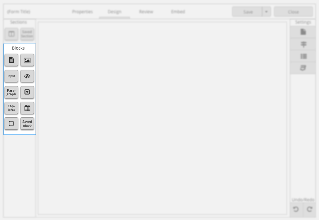
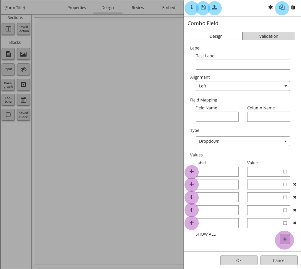
Architecturally, this was managed via the new slide-out panel, which houses basic configurations on the main screen while exposing advanced settings cleanly through dedicated tabs and header controls.
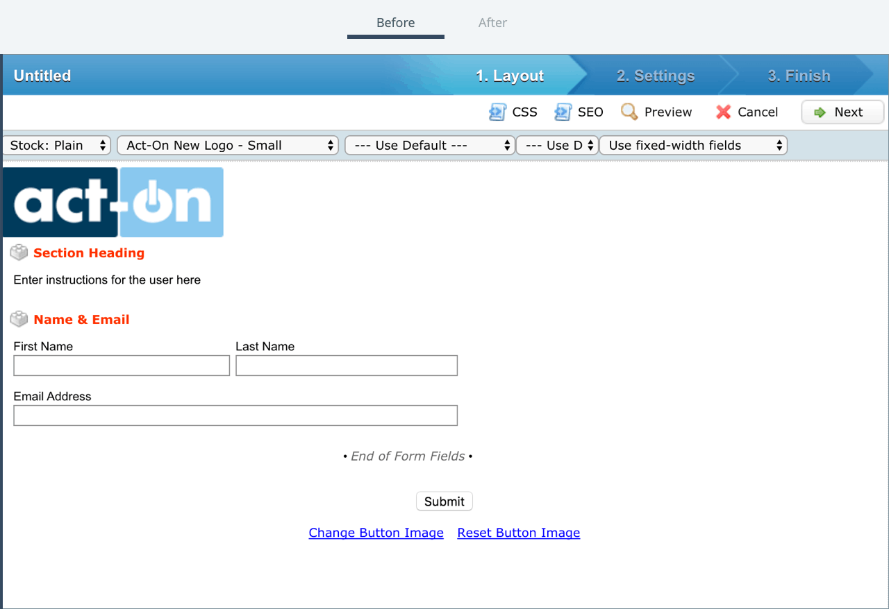
Before & After
A side-by-side comparison of the interface before and after the design system implementation highlights a massive leap in product maturity. The updated screens demonstrate a dramatic cleanup of the workspace, successfully hitting our core product goals: brand alignment, simplicity, and modular scalability.
Results
Following the global rollout of the redesigned, style-guide-compliant Form Builder, customer adoption tripled compared to the average baseline metrics of the classic tool.
We attribute this immense success to our structured product design process: explicitly defining the problem space, conducting thorough user research, establishing a unified directional framework, and maintaining a continuous feedback loop with both internal engineering teams and external users. While we frequently iterate on multiple design solutions, we know we are moving in the right direction when each progressive layout solves the core user problem more elegantly than the last.