Information-architecture
Re-evaluating the product navigation
Information-architecture
Re-evaluating the product navigation
At a Glance
Project Name: “Product Navigation: Evidence-Based Information Architecture”
| Challenge | The legacy navigation was built on internal assumptions rather than user behavior, leading to high cognitive load and frequent customer complaints regarding "findability." The lack of a logical structure was a primary source of friction in the user experience. |
|---|---|
| Outcome | Successfully reorganized the global product navigation by aligning the architecture with the users’ actual mental models. The result was a streamlined, intuitive interface that replaced guesswork with a data-backed navigational framework. |
| My Role | Lead UX Designer |
| Timeline | 9 Months |
| Activities | Stakeholders Interviews, Discovery Research, User Personas, Journey Map, Design Iterations |
| Success Metrics | Validated through a significant shift in user sentiment: a measurable decrease in navigational pain points and a marked increase in positive qualitative feedback. |
Challenge
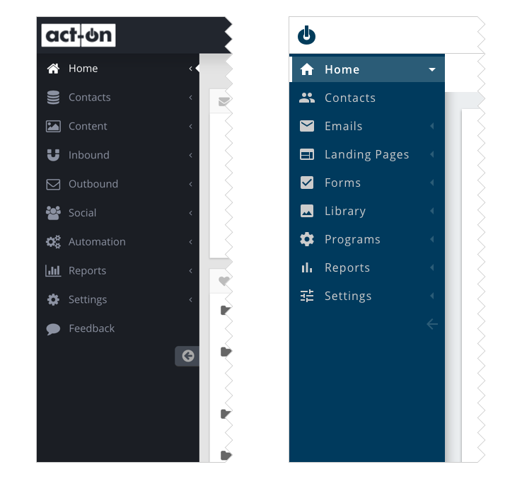
Our objective was to completely restructure the Act-On application's navigation system. The legacy navigation suffered from discoverability issues, making it difficult for users to locate specific features and obscuring the platform's core capabilities. Our goal was to eliminate these friction points and transform the navigation into one of the system's greatest strengths by making core tools highly intuitive and visible.
Historically, the app’s navigation had been organized around abstract marketing concepts: outbound and inbound marketing. We needed to conduct research to determine whether customers actually found this strategic division helpful, or if a different mental model would better serve their day-to-day workflows.
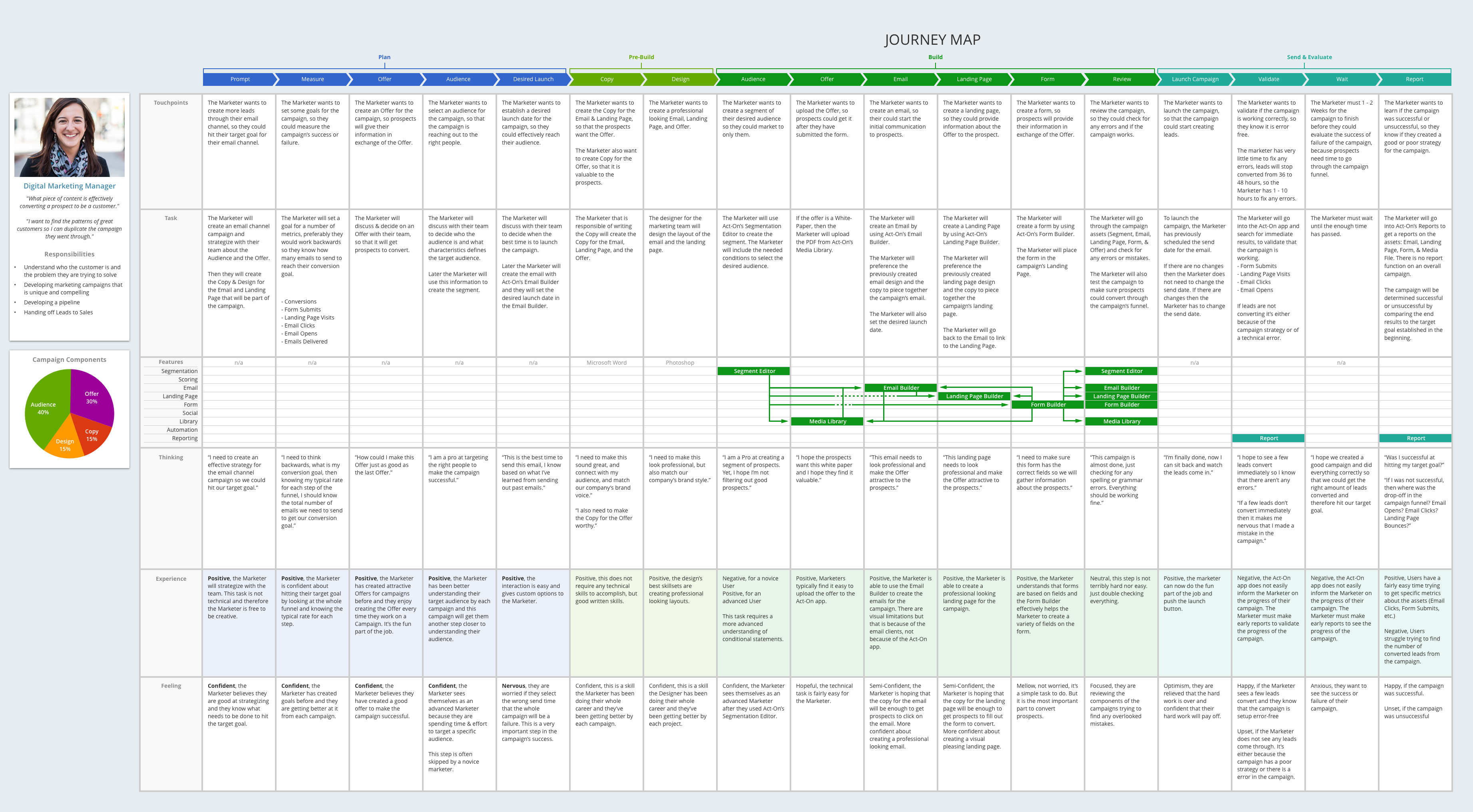
User Journey Mapping
To uncover our users' actual mental models, we developed a comprehensive journey map. We interviewed 10 customers to dive deep into their daily workflows, tasks, and operational pain points. Additionally, we partnered with our internal Customer Support department to leverage their hands-on insights. Because the support team regularly onboards new users and helps clients execute marketing campaigns from start to finish, they provided invaluable perspective on common user frustrations and specific customer needs.
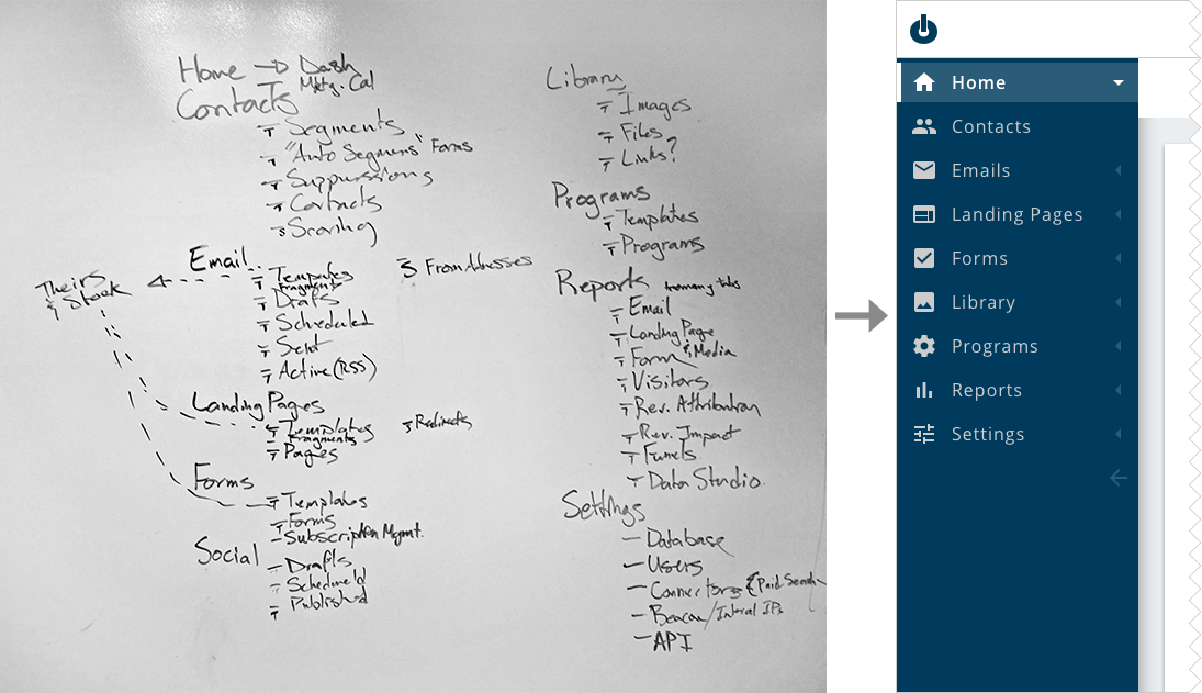
Collaborative Workshop
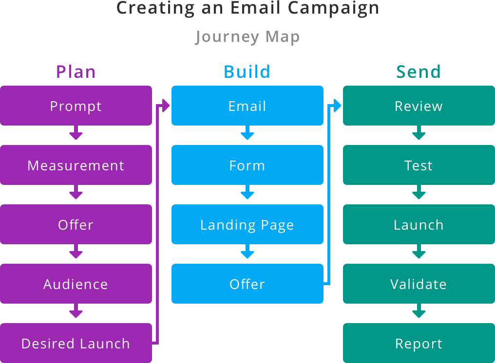
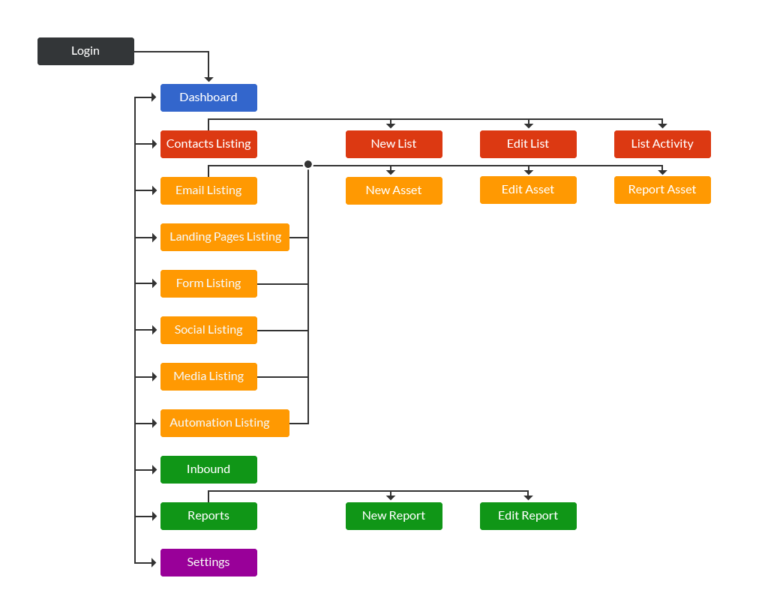
Armed with our journey map insights, the team conducted a whiteboarding workshop to completely reorganize the navigation hierarchy. The research clearly showed that a marketer’s primary intent is to create cohesive campaigns that drive prospects through a marketing funnel. Each campaign requires a defined target audience, an offer, visual design, and copy.
To map the navigation to this reality, we aligned the architecture with the natural campaign lifecycle:
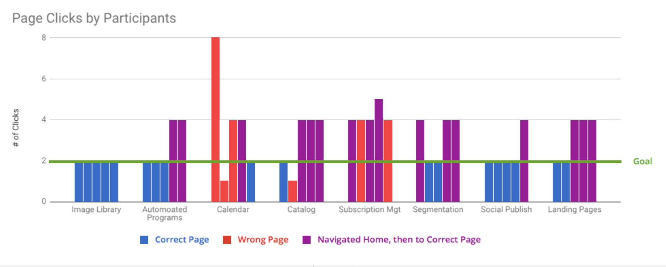
Usability Testing
We validated the new navigation model by running usability tests with 5 customers, splitting the cohort between three power users and two novice users. This allowed us to gather feedback from individuals deeply entrenched in the old system as well as those with zero prior familiarity with the app.
We tasked participants with locating 10 high-value pages. The results were highly encouraging: users successfully navigated to 8 out of the 10 pages on their first attempt. Even more telling was the qualitative feedback. One marketer perfectly summarized the flaw of the old system, noting: “As a marketer, I'm never thinking 'I need to do outbound activity today.' I just think, 'I need to go to landing pages or email.'”
Solution & Results
By shifting the application’s navigation away from abstract marketing theories and aligning it directly with tactical user workflows, we dramatically improved feature discoverability. Customer feedback was overwhelmingly positive, with users strongly preferring the task-oriented structure over the legacy model. Ultimately, because most users open the platform with a highly specific objective in mind, anchoring the navigation in that exact task-based logic has successfully empowered them to complete their daily work faster and with less friction.